Many years ago I had a print job for 100 black shirts and 100 white shirts with a one color image. The customer chose a medium grey ink that would show up on both shirt colors without having to change ink colors.
I printed the black shirts first, matched the ink color and all was well. Then I printed the first white shirt and immediately saw that the color looked drastically different. The grey looked much darker than on the black shirt. On second look, the grey actually looked lighter on the black shirt as well.
I thought that I was going insane. I knew that I hadn't changed inks in the screen; it had only been minutes between the shirt color changes, yet when I looked at the two shirt colors right next to each other, there was an obvious color difference between the two images.

The dress is the same color in both pictures! Your brain depicts the color differently in each photo because of the background color.
Well, the first thing I did was to pull out my Pantone book and check it to the color on the shirts. When I held the color swatch to the ink, the colors were the exact same. Of course they were, I hadn't changed inks!
I was at a loss. I thought that my client was bound to be upset about the color difference. I wasn't going to be able to move forward without finding an answer to this mystery, so I decided to do some research.
It turns out that I wasn't going insane and I hadn't done anything wrong at all. It all has to do with the way the human eye sees color in relation to light.
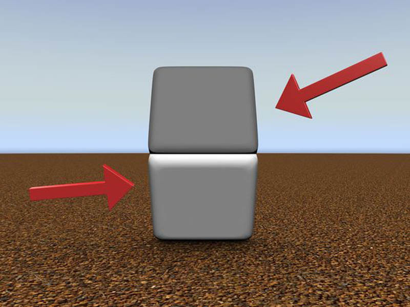
See what happens when you place your finger between the two squares

The "blue" and "lime green" colors are actually the same!
This is what I found out. As it happens, the eye sees color in relation to light. In the absence of light, colors appear brighter and vice versa. So when I was looking at the grey on the black shirt, in the absence of light, my eye was actually reflectinglight onto the color, making it appear brighter. On the the white shirt, the background absorbed the light and made the grey appear darker. Aside from the issues that it presented to me as a screen printer, I found this to be a fascinating subject.
If you would like to explore this further, as I did, watch this video that explains this phenomenon much better than I can.
Anyway, armed with my new found knowledge, I called the client and explained the dilemma. Fortunately they were very understanding and I was able to finish the order with no further problems.
Since then, I have come across this issue numerous times, but now I know what I'm dealing with and can usually let my clients know ahead of time of a possible concern.
However, this is not only potential problem that can come about when making color choices. Over the years, I have had the opportunity to further enhance my knowledge of color and can now usually anticipate likely concerns prior to production. In this way I am able to forewarn my clients of possible issues and come up with solutions, should one be needed, ahead of time.
So, what should you think about when choosing colors? Let me share a few things that I have learned to look for.
1. Background Color (Garment Color)
If you will be choosing multiple shirt colors for an order, keep in mind that not all ink colors will show up equally on all background colors. Usually, you will need to change one or more colors to make sure that your design will show up on all background colors. For one-color designs, choosing white on dark backgrounds and black on white backgrounds usually does the trick. Or, you can be adventurous and choose grey like the customer in my example. We can help you if you get stumped.
2. Multiple-Colored Designs
If using a multiple colored image, make sure that all the colors in the design will work with your garment color choice. If you’re using color on dark garments, the colors may change based on your background, as in the example. In many instances, we will use a white underlay as part of the design to brighten the colors on the garment and make them “pop”. Every design has its own personality. We are experts on making your design look great.
3. Does your design have a Face?
An often overlooked issue that we have seen over and over is the way that facial features will look on different backgrounds. For example, say you have a design for your high school that features your beloved panther mascot. If you print him in a dark color on a light background, he looks just fine. But take that same image and put him in a light color on a dark background and he will suddenly look like a photo negative. (See example) We don't want this to happen. Fortunately, this is usually an easy fix. We look for these issues and will help you with solutions.
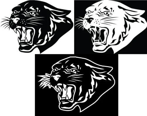
The image on the left is the original, but if we reverse the colors it looks like a photo negative on the right. The bottom photo is an example of how we can correct this.
4. Busy backgrounds
When printing on garments such as Camouflage or Tie Dye, special attention needs to be paid to the design to make sure that it doesn't get lost. They don't call it “camo” for nothing. Usually all it takes is adding an outline to the design to pull it away from the background and bring it back to the forefront where it belongs.
5. Contrast
Does your background and design color(s) have enough contrast? For example, yellow on white just doesn't show up very well. Same goes for black on navy. Sometimes a tone on tone look is desirable, and can complement a multiple colored design, but in most cases you're going to want your design to show up. This is definitely something that we look for and will help fix a problem should it arise.
6. Brightness
I'm sure by now you're probably thinking that I've digressed into television settings, but this is actually an important issue. Some designs look better with a “vintage” or faded look. Also, sometimes you want colors to be more subtle on the background color. I have learned to recognize these qualities in designs and where a design will benefit with a more toned down look. As I said earlier, each design has its own personality. Sometimes turning down the brightness is just what the doctor ordered.
Color choices can make or break a design. We recognize that a lot of thought and expense goes into the planning of your project. We are here to help you get the most out of your design, so if you have further questions on color, please let us know. It's all part of how we help you “Express Yourself”.